There is an old Russian saying: “Ремонт хуже пожара,” or “Renovation is worse than a fire,” which I thought was just an old Russian saying until two days ago.
That’s when they finished the renovation of our apartment building’s lobby.
HRH, (my “Horrible Russian Husband”) and I live in a modern building in a somewhat business enclave part of central Moscow. Like most new buildings in Russia, during the initial construction period, the cheapest possible materials were used on the façade and the public areas of the building (the lobby and the stairwells.) The theory behind this cheapskate approach is that the residents will get together and upgrade their own particular part of the building, deciding as a collective body in sort of a neighborhood association on a certain design style, price range, the kind of materials and which amenities they desire and can afford. Decisions such as uniformed neo-fascist thug security guard, versus helpless old lady with purple hair.
Our “podezd” or entry way was the last to do anything about upgrading the facilities, primarily because a lot of people were still renovating their apartments, and it was generally agreed that we should wait until all the “capital renovations” were completed.
I’m not sure what happened next – as I spent some time away from Moscow last spring and anyway, I’m never really encouraged to go to these kind of neighborhood association meetings, but suddenly, after months of picking our way through the rubble of the lobby, we began to see the new design of the lobby take shape.
And it became clear to me that many people had missed the neighborhood association meetings.
I also began to realize with growing horror that those who had gone to the meetings and approved the design scheme were either on some kind of very bad acid trip or had formulated their ideas of beauty and elegance in the lobbies of four star hotels in the Red Sea resort town of Hurghada.
The flooring is that sort of highly polished faux marble tiling honed and polished in a Balkan state that doesn’t QUITE fit together. I’m betting ours was actually designed for the bathroom rather than an entry way, particularly in a country where ice and snow make slipping and sliding and landing on your spine on highly polished marble a very real possibility from September – April.
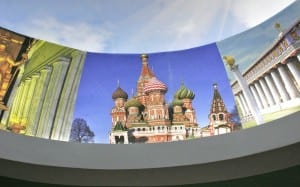
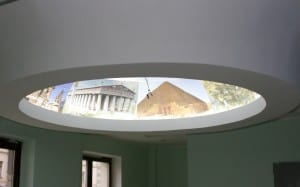
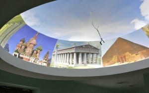
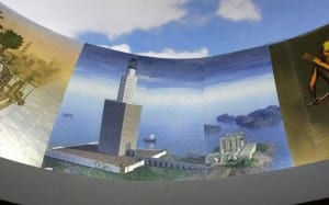
If you land on your backside, however, you will have an unrivaled view of the inside of our lobby’s cupola (we have no actual dome in our building, but we have the inside of a cupola.) And maybe landing on your backside will be a good thing, as it could prevent you from knocking your head on the cupola – it’s that low hanging. Around the inside is a mural made from what I now know is called “photo wallpaper” of The Seven Wonders of the Ancient World…plus St. Basil’s Cathedral: a design theme that may seem incongruous if you haven’t spent enough time in the resort towns of southern Turkey. To me, it is a nostalgic reminder of the good ole days when Russia was only an occasional guest at what was then known as the G7. I sense a large, and very ornate crystal chandelier will be installed any day now. Watch this space.
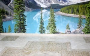
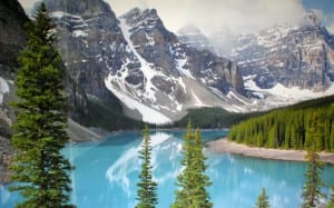
I have slight concerns that the large and ornate crystal chandelier could possibly clash with the imposing mural on the main wall across from the door, which overwhelms the visitor upon arrival: a floor to ceiling “photo wallpaper” rendition of a mountain range, crystal clear lake, and lush forest that is either Colorado or Tibet but certainly no place in the Russian Federation. It might be one of the natural wonders of the world, but I can promise you it is definitely not a wonder of wallpaper hanging.
The Tadzhik building workers, security guards, and a few of the building’s domestic workers all think it is a sucess fou. They have spent much of the past few days photographing each other in front of the almost-completed masterpiece, which is why none of them appeared at all nonplussed when I turned up, Canon in hand.
Because pictures are worth a thousand words, I include a full photo essay of our lobby, which I encourage you to browse in the sober contemplation that you should always, always, always go to your neighborhood association meeting. Even if you’re encouraged not to…
Comment gallery open…

OMG! How beautiful!!! (kidding of course))) modno-dorogo-bogato )) Couldn’t expect less from neighborhood association (domoupravleniye?)! The next logical steps they should do – to put a big wooden board on the wall (for announcements and ads) and glue the non-slippery mats on the marble floor )
A piece of advise – you should built a photo gallery widget in – so we could watch all pics in one window, otherwise you need to click twice on every picture to see the bigger version ))
Anyway thanks for a post )) Москвичи такие москвичи )))
Nick,
Thanks for your thoughts — I agree a gallery is a better idea. I’m having some problems uploading photos and I was very frustrated.
Glad you like the snaps and the piece. It certainly is…different.
Thanks for stopping by!
Oh, HAHAHAHAHAHA! That is HILARIOUS! I love it!!
[pees herself, just a little, laughing]
Don’t you just miss Russia?
Jennifer. Those photographs are every bit as beautiful as you led me to believe. I particularly like the loose-hanging electrical flex in the centre of the majestic cupola; the possibilities for further examples of Russian-style design are endless…
Oy…
That wire worries me. I’m guessing a Czech “lustre” is on its way, but of course it could be quite anything…anything at all. You are so right!
Stay well!
From the Desk of the Lovely Lady with an Entire Family of Fake Deer in her Dining room:
I really love it!!! It’s swank and bright and happy, and I just love it. I would move in if I could, which I can’t or HRH would likely kill you, so I will just visit a lot!
🙂
Let me tell you this — all that lobby needs is a pair of those charming deer. Such a pity they were a limited edition, right?
Is this a lobby or the nave of a Unitarian church?
If only.
That is the lobby of our APARTMENT BUILDING…as in THE PLACE WHERE WE LIVE. I will not be able to have any more of those Barack Obama fundraisers here, clearly.
Makes me thankful for my paradnaya with the missing tiles and sign alterting to where the non-existent dumpsters are located.
Dear Vanessa,
Any vacancies in your building????
It is all kommunalkas, and in St. Petersburg. Your lobby is a good example of why I remain here and refuse to chase the big bucks in Moscow.
(mouth dropping open and hitting keyboard)
I know, Melissa. You want something similar for your home in Pennsylvania…but will it go with your early Amish furniture? You don’t want anything to clash, do you?
I’m not lauging at your lobby, Jennifer. I’m laughing with it.
(and crying from that laughter, I might add)
All I can say is: I am sooooo sorry!
The general feeling is that there may be another whip round for a re-renovation…
Oh, goodness! See, this is the quirky oh-so-Russian things I miss about Moscow (of course, I don’t have to live there!) And granite on the floor must have been chosen by the same people who chose it for the perehod stairs….people with a mean streak! Good luck!
Dear Mary:
I will miss it too — once the residents rise up and lynch the building’s Kommendant (that’s what he’s called) who chose all this.
Jennifer
Stunned. The dome is unspeakable. Though what does it say about me that I spent a few minutes daydreaming, out-of-focus, at that Rocky Mountain Lake scene–wishing I were there instead of facing the day’s work?
Uncle Pasha,
Have you been sniffing the German Sharpies again? I thought they didn’t approve of that in the Ivy League?
Y-L-S-I-L
I…I…
I don’t even understand what I am looking at. That is just bad. Yikes. The missing light fixture is really the best part.
I think that light fixture will be installed tomorrow…
Jennifer, What a fantastic lobby, I was just going to repaint the portico and entryway white but noe the pressure is on to bring the world to my vestibule!
For your house, I see something a little more restrained and faithful to the period, like the maybe a full scale depiction of the Springfield, MA skyline, including the BasketBall Hall of Fame: done in purple highlighters. Thoughts?
My sympathies! Please, do not forget to post a photo with the lustra! That’ll be last straw.
Dearest Ella,
What in the world makes you think that will be the last straw? I’m sure this is just the tip of the iceberg!
Faithfully,
J
Darlink – your new lobby is simply divine and so long awaited……tee-hee!!!
Can’t wait to see the obscuring chandelier!!
Dear Heidi,
Regretting ever saying anything nasty about your Orange Sherbert flat.
J
Well that is…a bold statement. In picture wallpaper.
The tiles remind me of the building where I worked in Zheleznedorozhny, where the owner suddenly became flush and ordered his friends from the south to cover the front steps in shimmering faux-marble tiles. He had to get the same guys to nail rubber car mats to the steps once the snow came, as no one could get to the front door without cracking their skulls.
Miriam,
That is hilarious! I think we’ll be sourcing something similar this week!
Thank you, as ever for your very funny comments!
J
Do you know, I rather like it. Someone has tried very hard. It would be tremendously stimulating if you were, say, an impressionable child under the age of 8. And at least the marble isn’t a sinister and depressing ox-blood red and covering every surface. And I’ve had huge fun identifying that lake as Emerld Lake, Alberta. Haha! Katex
Kate, that is positively brilliant! Wait until i dazzle the masses with Canadian reference. Someone has indeed tried terribly hard…maybe a little too hard!
I LOVE it! I thought you were making it up until you backed it up with pics. This might just be reason enough for a visit (provided you invite me :)).
Fantastic. Thank you!
Katya,
always welcome! I hope you will come soon!
J
Yes, I noticed this most unique decorating when I was leaving your place the other day. Look at the bright side, you’ll never get used to it.
Those slippery tiles will be the death of us all! Entering a ZhEK the other day (don’t ask), I did manage to clear the 10cm-high metal threshold. However, I wasn’t prepared for a slippery *and* dusty floor as well as a crowd of people clustered around the kassa dangerously close to the doorway. My attempt to maneuver to avoid the crowd ended with me in the arms of an elderly gentleman, and we both went down, with my left knee breaking my fall. I’m still amazed that he didn’t break anything. Will not include pictures of my purple knee.
Those tile-makers are a sadistic bunch, I’m convinced.
Theresa –
Awful story! Slippery and dusty is a bad combination, but characteristic of the ole ZhEK HQ. I want to know more about the 10-cm high metal threshold, though….
so easy for strollers, wheelchairs and the like! What gives?
J
I’m L O L, Jennifer– the wonders-of-the-world photo essay inexplicably enshrined in-the-round in the cupola is jawdropping. The Grand Tetons-and-water-feature floor-to-ceiling photo makes a tempting terminal point for those inevitable slides across the slick marble floor: one can fall down, slide inexorably toward deep waters, and then be rescued from drowning by smacking into the wall. What’s not to like? Dignity and intact hip joints are over-rated!
I really enjoy your writing. Your sense of humor is wonderful, as are your observations…I have been to Moscow several times (my wife is from Russia-Novosibirsk). Could you make the type darker? The grey type is difficult to read. The design of the new website is beautiful. I like the graphic look very much. Thanks, and keep writing. This is great.
I am glad they still have some of that “Soviet Green” paint there (I can see it on the walls). I think someone got a deal on that paint long ago and they’re still trying to use it up! I’ve never been in a Russia “podezd” or hallway that wasn’t that color.
I enjoy your blog. Keep up the good work!
Hahahahahahaha… Simply amazing. Very po-russki or po-moskovski. Love your blog, you’re great! Ps: You should probably start going to those meetings, or you might be running a risk of having either a small fountain or a “beautiful” and sizeable Italian statue under that cupola or even worse in your elevator… you know to soothe the terrible Russian nervy or to add solidnost to your pod’ezd, who knows…
I’m with Kate; I kind of like it. And unless I pay a king’s ransom for where I live and am easily the most important person in the building, I try not to hurt my neighbours’ feelings just in case they happen to like it, too. I realize it’s not the Moscow Metro, but it’s not as if Russians have no sense of style compared with westerners.
http://4.bp.blogspot.com/_o_oEpXGCM94/S9Ydexpg7fI/AAAAAAAAAW4/u5eVhbKFvBk/s1600/beach_bathroom.jpg
It’s actually Moraine Lake, also in Alberta; here’s a larger shot.
http://www.1000lonelyplaces.com/wp-content/uploads/2011/10/Picturisque-Beauty.jpg
You can see the disctinctive triple peak in the centre, and the fall of gravel on the left shore which is barely visible through the trees in the shot in your lobby. The two must have been taken from very nearly the same spot. Many of the lakes in the region, including the well-known Lake Louise in Banff National Park, have that dizzying emerald colour. That’s because all of them are glacial lakes, and the iridescent colour results from “rock flour”, finely-ground bedrock carried into the lake from glacier melt.
Lord help us all…
Your beautiful new 7 Wonders might be rather profitable for tours open to the public on Tuesdays between 3-5pm and you could sell postcard souvenirs, too. Free Admission for seniors, of course. Enjoy! xo Nicola